I get it, you want to have beautiful effects on your website, maybe to show that something’s not right or broken! Doesn’t really matter, since you want to have glitch effects in WordPress, then here’s how to create glitch effect texts in WordPress.
The steps to create a glitch effects texts in Elementor:
Ok, so this is rather simple, I have prepared everything that you need, all you have to do is follow the steps and you should get the glitch effects.
The process has two steps, first we create the CSS (animations), then we add the HTML (texts), and give it the CSS class we created in the first step.
- You have to add the following CSS.
- Add the glitch class to your text’s HTML.
- Make customizations to the glitch effect animation
Add the glitch CSS code on your WordPress website
First of all, copy and paste this code in your website:
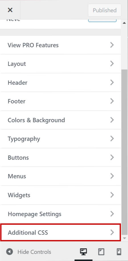
- Go to your WordPress dashboard -> Customize
- Scroll down to Additional CSS
- Paste the code
body {
  min-height: 100vh;
  display: grid;
  place-items: center;
  color: #E0C935;
}

.glitch {
  text-transform: uppercase;
  position: relative;

  text-shadow: 0.05em 0 0 rgba(255, 0, 0, 0.75),
    -0.025em -0.05em 0 rgba(0, 255, 0, 0.75),
    0.025em 0.05em 0 rgba(0, 0, 255, 0.75);

  animation: glitch 900ms infinite;
}

.glitch span {
  position: absolute;
  top: 0;
  left: 0;
}

.glitch span:first-child {
  animation: glitch 650ms infinite;
  clip-path: polygon(0 0, 100% 0, 100% 45%, 0 45%);
  transform: translate(-0.025em, -0.0125em);
  /* color: green; */
  opacity: 0.8;
}

.glitch span:last-child {
  animation: glitch 375ms infinite;
  clip-path: polygon(0 80%, 100% 20%, 100% 100%, 0 100%);
  transform: translate(0.0125em, 0.025em);
  /* color: red; */
  opacity: 0.8;
}

/* https://web.dev/prefers-reduced-motion/#(bonus)-forcing-reduced-motion-on-all-websites */

@keyframes glitch {
  0% {
    text-shadow: 0.05em 0 0 rgba(255, 0, 0, 0.75),
      -0.05em -0.025em 0 rgba(0, 255, 0, 0.75),
      -0.025em 0.05em 0 rgba(0, 0, 255, 0.75);
  }
  14% {
    text-shadow: 0.05em 0 0 rgba(255, 0, 0, 0.75),
      -0.05em -0.025em 0 rgba(0, 255, 0, 0.75),
      -0.025em 0.05em 0 rgba(0, 0, 255, 0.75);
  }
  15% {
    text-shadow: -0.05em -0.025em 0 rgba(255, 0, 0, 0.75),
      0.025em 0.025em 0 rgba(0, 255, 0, 0.75),
      -0.05em -0.05em 0 rgba(0, 0, 255, 0.75);
  }
  49% {
    text-shadow: -0.05em -0.025em 0 rgba(255, 0, 0, 0.75),
      0.025em 0.025em 0 rgba(0, 255, 0, 0.75),
      -0.05em -0.05em 0 rgba(0, 0, 255, 0.75);
  }
  50% {
    text-shadow: 0.025em 0.05em 0 rgba(255, 0, 0, 0.75),
      0.05em 0 0 rgba(0, 255, 0, 0.75), 0 -0.05em 0 rgba(0, 0, 255, 0.75);
  }
  99% {
    text-shadow: 0.025em 0.05em 0 rgba(255, 0, 0, 0.75),
      0.05em 0 0 rgba(0, 255, 0, 0.75), 0 -0.05em 0 rgba(0, 0, 255, 0.75);
  }
  100% {
    text-shadow: -0.025em 0 0 rgba(255, 0, 0, 0.75),
      -0.025em -0.025em 0 rgba(0, 255, 0, 0.75),
      -0.025em -0.05em 0 rgba(0, 0, 255, 0.75);
  }
}

@media (prefers-reduced-motion: reduce) {
  *,
  ::before,
  ::after {
    animation-delay: -1ms !important;
    animation-duration: 1ms !important;
    animation-iteration-count: 1 !important;
    background-attachment: initial !important;
    scroll-behavior: auto !important;
    transition-duration: 0s !important;
    transition-delay: 0s !important;
  }
}
I’m not the author of the code, here’s the source of the code. https://codepen.io/kevinpowell/pen/YzqerQm
Add the glitch class to your text’s HTML
Alright, for all the inpatient people I will write here how to do it, then I will explain it.
Let’s say you want to glitch a WELCOME text, this is how you do it now.
Add the Title widget -> Copy & paste the following:
<h1 class="glitch">
  <span aria-hidden="true">Welcome</span>
  Welcome
  <span aria-hidden="true">Welcome</span>
</h1>
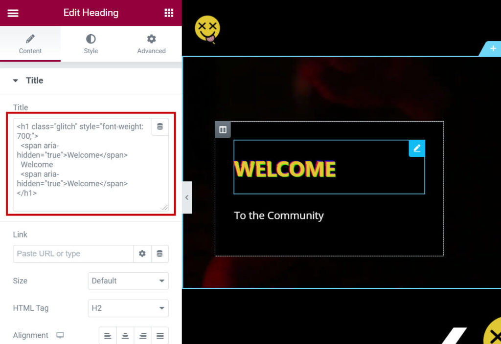
Explanation:
As you noticed, we’re repeating the same word/sentence 3 times, this is because the glitch effect class has 3 components.
- In the first line of the code, we’re defining the text to be heading 1 (h1), and then giving it the glitch class, which we have created in the additional CSS in step 1 (class=glitch).
- In the second line, we’re writing the first child of the glitch class.
- The third line gives the regular text.
- The fourth line defines the last child of the glitch class.
Make customizations to the code
The main customizations that you might want to do with the code are:
- Text color
- Animation speed
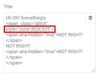
1. Text color:
You have 3 ways to edit the text color:
Option 1:
Change the color in the 5th line of the code with your preferred color.
Option 2:
Change the color from the HTML text code. When you’re defining the text to be glitch class, add the following: <h1 class=”glitch” style=”color:#c60202;”>
2. Animation speed
In the 16th line of the code, where it says animation: glitch 900ms infinite;
Change the 900 to a bigger number if you want it to be slower and to a smaller number if you want it to be faster.
You have the same piece of code for the first and last childs on lines 26 & 34.


